위와 같이 스크롤 함에 따라 큰 박스가 3개로 나눠지고 뒤집어져서 뒷면이 나오는 기능을 구현해봤다.
HTML
<divclass="section">
<divclass="wrapper">
<divclass="grid">
<divclass="card-box">
<divclass="card-front">
<p>카드1</p>
</div>
<divclass="card-back">
<p>뒷면</p>
</div>
</div>
<divclass="card-box">
<divclass="card-front">
<p>카드2</p>
</div>
<divclass="card-back">
<p>뒷면</p>
</div>
</div>
<divclass="card-box">
<divclass="card-front">
<p>카드3</p>
</div>
<divclass="card-back">
<p>뒷면</p>
</div>
</div>
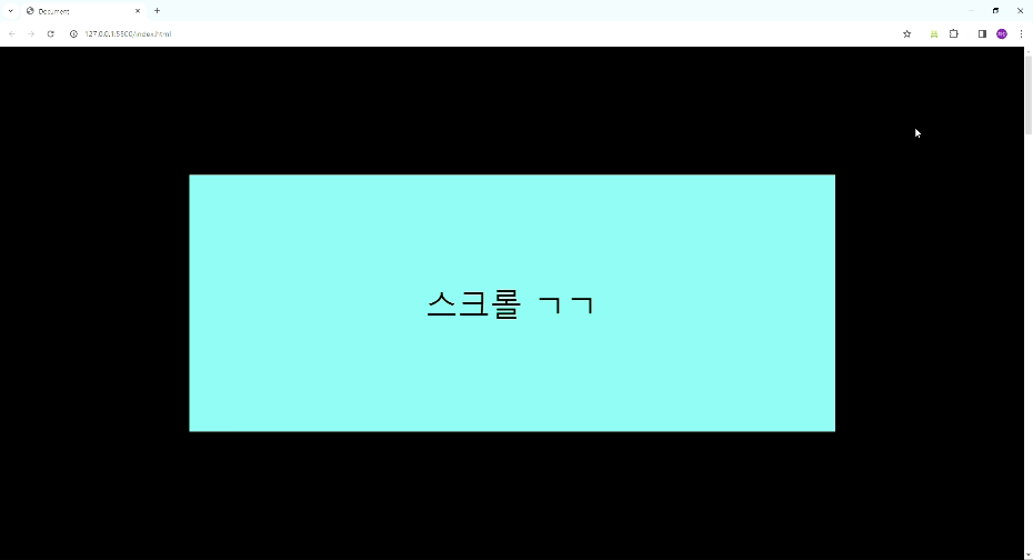
<divclass="front">스크롤 ㄱㄱ</div>
</div>
</div>
</div>
CSS
.section{
height: 6000px;
}
.wrapper{
width: 100%;
height: 100vh;
position: sticky;
top: 0;
display: flex;
justify-content: center;
align-items: center;
background-color: black;
}
.grid{
display: grid;
width: 1200px;
height: 50vh;
grid-template-rows: 1fr;
grid-template-columns: 1fr1fr1fr;
grid-auto-columns: 1fr;
align-content: center;
justify-content: center;
justify-items: center;
margin-left: auto;
margin-right: auto;
position: relative;
}
.card-box{
width: 100%;
height: 100%;
position: relative;
}
.card-front{
width: 100%;
height: 100%;
background-color: aquamarine;
transform-style: preserve-3d;
display: flex;
align-items: center;
justify-content: center;
border-radius: 16px;
perspective: 300px;
font-size: 60px;
}
.card-back{
width: 100%;
height: 100%;
background-color: blue;
transform-style: preserve-3d;
display: flex;
align-items: center;
justify-content: center;
border-radius: 16px;
perspective: 300px;
transform: rotateY(180deg);
position: absolute;
top: 0;
left: 0;
z-index: -1;
font-size: 60px;
}
.front{
position: absolute;
top: 0;
left: 0;
background-color: aquamarine;
width: 100%;
height: 100%;
display: flex;
align-items: center;
justify-content: center;
font-size: 60px;
}
우선 section으로 height를 크게 잡아주고 wrapper로 100vw, 100vh의 크기로 position: sticky를 걸어주었다.
그리고 grid 박스는 position:grid로 card-box를 세개로 나누어주었다.
card-box에 position:relative를 걸고 안에 card-front와 card-back을 넣어주고 card-back만 position:absolute를 하여 z-index를 -1로 하여 안보이게 한 후 rotateY로 180도 미리 회전시켜주었다.
그리고 맨 앞에 깔아줄 front 박스를 만들어 position:absolute로 띄어준다. 일종의 트릭이라고 할 수 있다.
* 사실 card-box 3개가 붙어있다가 단순히 떨어지는 것뿐만 아니라 front도 opacity로 조절해준다. 이렇게 한 이유는 지금은 단색으로 background색이 정해져있지만, 만약 사진이라고 가정하면 그냥 div 세개를 떼어냈다가 붙였다 하는 것보다 앞에 가려주고 opacity로 조절하는 것이 더 자연스러울 것이다.
* card-back을 먼저 rotateY 180도를 해준 이유는 180도로 회전되었을 때의 div의 모양은 좌우가 반전된 모양으로 있기 때문에 먼저 돌려주고 javascript안에서도 card-back의 transform값을 cardRotate + 180으로 해준다. 그러면 좌우반전 안되고 제대로 보이는 카드를 만들 수 있다.
* card-front와 card-back을 보면 forEach반복문을 쓴 것을 볼 수 있는데, forEach 반복문은 애초에 array 자료에서 쓰는건데 왜 썼는가?
document.querySelectorAll('.card-front')를 console창에 출력해보면 nodelist라고 뜬다. 처음에 forEach 반복문으로 안쓰고 그냥 style을 변경하려 했을 때 오류가 뜨면서 작동하지 않았다. 이 nodelist를 forEach반복문으로 다루면 오류가 해결된다.