
반응형
250x250
Notice
Recent Posts
Recent Comments
Link
| 일 | 월 | 화 | 수 | 목 | 금 | 토 |
|---|---|---|---|---|---|---|
| 1 | 2 | 3 | 4 | 5 | 6 | |
| 7 | 8 | 9 | 10 | 11 | 12 | 13 |
| 14 | 15 | 16 | 17 | 18 | 19 | 20 |
| 21 | 22 | 23 | 24 | 25 | 26 | 27 |
| 28 | 29 | 30 | 31 |
Tags
- pointermove
- scrollY
- input
- NodeList
- forEach
- 이벤트리스너
- 스크롤
- Sticky
- React
- localstorage
- getBoundingClientRect
- Hover
- 반복문
- 애니메이션
- mousemove
- width
- scrollevent
- swiperjs
- classList
- NAV
- addEventListener
- insertAdjacentHTML
- 확장성
- JavaScript
- swiper
- html
- Animation
- scroll
- For
- css
Archives
- Today
- Total
ZeroToHunnit Coding
[Javascript] 특정 박스에 도달했을 때 활성화되는 하단고정메뉴 본문
728x90
반응형
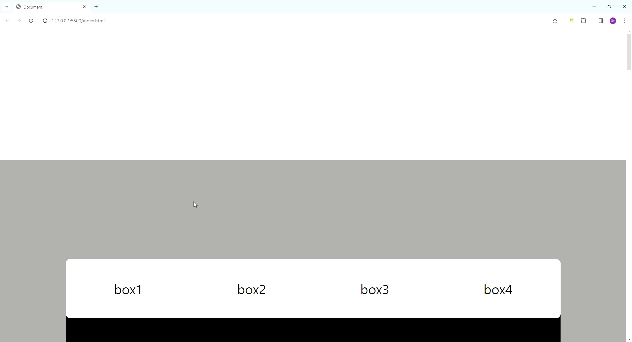
각 박스에 도달하면 하단 고정 메뉴안에 해당되는 박스의 메뉴가 활성화되고 큰 섹션을 나가면 모든 활성화가 사라지는 ui를 만들어 보았다.
HTML
<div class="section">
<div class="box">
<p>box1</p>
</div>
<div class="box">
<p>box2</p>
</div>
<div class="box">
<p>box3</p>
</div>
<div class="box">
<p>box4</p>
</div>
<div class="menu">
<ul>
<li>box1</li>
<li>box2</li>
<li>box3</li>
<li>box4</li>
</ul>
</div>
</div>
섹션안에 박스 네개와 list가 포함된 menu박스를 만들어주었다.
CSS
.section{
margin-top: 400px;
margin-bottom: 400px;
background-color: #999;
padding: 200px;
}
.box{
width: 100%;
height: 150vh;
margin-top: 200px;
background-color: black;
color: white;
font-size: 60px;
}
.menu{
position: sticky;
bottom: 100px;
padding: 40px;
border-radius: 14px;
background-color: white;
margin-top: 100px;
}
ul{
display: flex;
justify-content: space-between;
}
li{
width: 300px;
height: 100px;
display: flex;
align-items: center;
justify-content: center;
font-size: 40px;
color: black;
border-radius: 12px;
transition: all 0.3s;
}
.on{
background-color: black;
color: white;
}
menu는 position:sticky와 bottom: 100px을 통해 section에 들어왔을 때 바닥에서 100px 띄어서 고정되게 했다.
* position: sticky는 꼭 좌표값을 정해주어야 한다.
on클래스를 미리 만들어서 javascript로 클래스를 부여해주는 방식을 사용했다.
JAVASCRIPT
const menu = document.querySelectorAll('.menu ul li');
window.addEventListener('scroll', function () {
for (let i = 0; i < document.querySelectorAll('.box').length; i++) {
if (document.querySelectorAll('.box')[i].getBoundingClientRect().top < 630) {
onRemove()
menu[i].classList.add('on');
}
}
if (document.querySelector('.section').getBoundingClientRect().top > 200) {
onRemove()
}
if (document.querySelector('.section').getBoundingClientRect().top < -6200) {
onRemove()
}
});
function onRemove() {
menu.forEach(function (e) {
e.classList.remove('on');
});
}
window의 scroll을 감지하는 이벤트리스너를 사용해 각box의 화면안에서의 꼭대기 위치를 구하는 getBoundingClientRect를 사용해 조건식을 구해주고 모든 클래스를 한 번 없애준 후에 각 menu에 클래스를 부여하는 for반복문을 사용했다. 그리고 section바깥을 나가게되면 모든 클래스를 없애는 조건문도 짜주었다.
이렇게 짜면서 든 생각인데 저렇게 특정 위치값을 숫자로 고정시켜놓으면 반응형 작업을 할 때 힘들겠다 라는 생각이 들면서 어떻게하면 확장성이 좋게 코드를 짤 수 있을까하는 고민이 드는 시간이었다.
728x90
반응형
'JAVASCRIPT' 카테고리의 다른 글
| [Javascript] 로딩페이지 만들기 (0) | 2024.01.15 |
|---|---|
| [Javascript] SwiperJs로 스크롤되는 3d 캐러셀 만들기 (0) | 2024.01.12 |
| [Javascript] Select(콤보박스)에서 선택한 값 출력하기 (2) | 2024.01.09 |
| [Javascript] 'mouseover'를 사용하여 컨텐츠 보이게하기 (2) | 2024.01.06 |
| [Javascript] 다양한 기능들로 만든 멋진 scroll이벤트 (0) | 2024.01.04 |
'JAVASCRIPT' Related Articles
more


